Is Your Website Hurting Your Sales? 5 Design Mistakes That Cost You Conversions
6/4/20253 min read
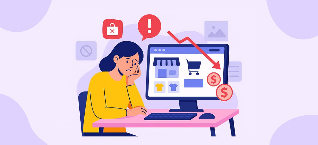
Your website might look clean, modern, even impressive—but is it actually doing its job?
A good-looking website isn’t enough. If it’s not converting visitors into customers, it’s costing you money. In fact, small tweaks to your layout, calls to action, and page speed could make the difference between someone clicking “Buy” and bouncing forever.
Here are 5 silent design mistakes that could be holding your business back—and how to fix them before they impact your bottom line.
1. Cluttered Layout
A cluttered website overwhelms your visitors. When everything is trying to stand out, nothing stands out. People don’t know where to look—or worse, what to do.
What it looks like:
Too many buttons or competing CTAs on one page
A homepage packed with images, sliders, and pop-ups
Sections that blend together with no visual hierarchy
Fix it:
Use white space to separate sections and give the eye a break
Organize content with clear headings, grid layouts, and consistent spacing
Stick to one core message per screen
A salon website had 12 service categories all on the homepage—hair, nails, lashes, waxing, massage, and more—all with different styles and banners. After simplifying it down to three visual blocks with dropdowns, they saw a 24% increase in bookings within a month.
2. No Clear CTA
Visitors shouldn’t have to guess what you want them to do. Every page—yes, every page—needs a clear call to action (CTA).
What it looks like:
No obvious “next step”
Buttons that say vague things like “Learn more” without direction
Pages that just end with no prompt
Fix it:
Use one primary CTA per page, like:
“Book a free consultation”
“Get 10% off your first order”
“Sign up for our newsletter”
Make your CTA stand out visually (use contrasting buttons and repeat it as needed)
A boutique fitness studio added a bold, fixed “Try a Free Class” button to their homepage. Within 2 weeks, trial sign-ups doubled.
3. Mobile Unfriendly Design
More than 60% of web traffic comes from mobile devices. If your site isn’t easy to use on a phone, people will leave—fast.
What it looks like:
Text too small to read
Buttons too close together
Horizontal scrolling
Pop-ups that can’t be closed
Fix it:
Use responsive design that adapts to screen size
Check your site manually on different phones and tablets
Prioritize mobile performance (think finger taps, fast loads, and minimal scrolling)
An e-commerce brand realized their “Add to Cart” button was hidden behind a sticky footer on iPhones. After fixing it, cart abandonment dropped by 18%.
4. Slow Load Speed
Speed is everything online. A delay of just 1 second can drop conversions by up to 7%.
What it looks like:
Pages that take more than 3 seconds to load
Large image files and videos that lag
Excessive scripts, plugins, or animations
Fix it:
Compress images and video files
Use caching tools and content delivery networks (CDNs)
Choose fast hosting and audit third-party scripts regularly
A local restaurant’s site took 7 seconds to load because of oversized hero images. After optimizing the media and switching to lightweight hosting, reservations increased by 30%.
5. Stock Image Overload
Generic stock photos don’t build trust. People want to connect with real faces, real products, and real spaces.
What it looks like:
Cheesy photos of overly happy call center reps
Pictures that look nothing like your business
Repeating images across multiple pages
Fix it:
Use photos of your actual team, space, or products
Hire a local photographer for a brand shoot (or use a phone with good lighting!)
Replace stock with user-generated content like customer photos or testimonials
A family-owned coffee shop replaced all stock photos with pictures of their real space and customers. Social shares increased, and foot traffic grew noticeably within weeks.
Your Website Should Be a Sales Tool—Not a Bottleneck. Design isn’t just about aesthetics—it’s about conversion. Your site should guide your visitor’s journey, spark trust, and make it effortless to take action. If it’s not doing that, a redesign or even a few strategic tweaks could change everything.
Want help fixing your site’s conversion killers? Let’s talk.
Ready to Twist Your Brand Into Shape?
Let’s create something bold, scroll-stopping, and built to make your audience care.
Book a free discovery call — no pressure, just smart ideas and real strategy.
Have questions? Email us directly:
hellopretzelmarketing@gmail.com
PRETZEL MARKETING
Big ideas for small businesses — powered by purpose, personality, and real strategy.
pretzelmarketing.digital@gmail.com
Copyright © 2025. Pretzel Marketing. All rights reserved.


More About Us: